Oddity Events and Marketing has announced a brand refresh following its fifth year in business.
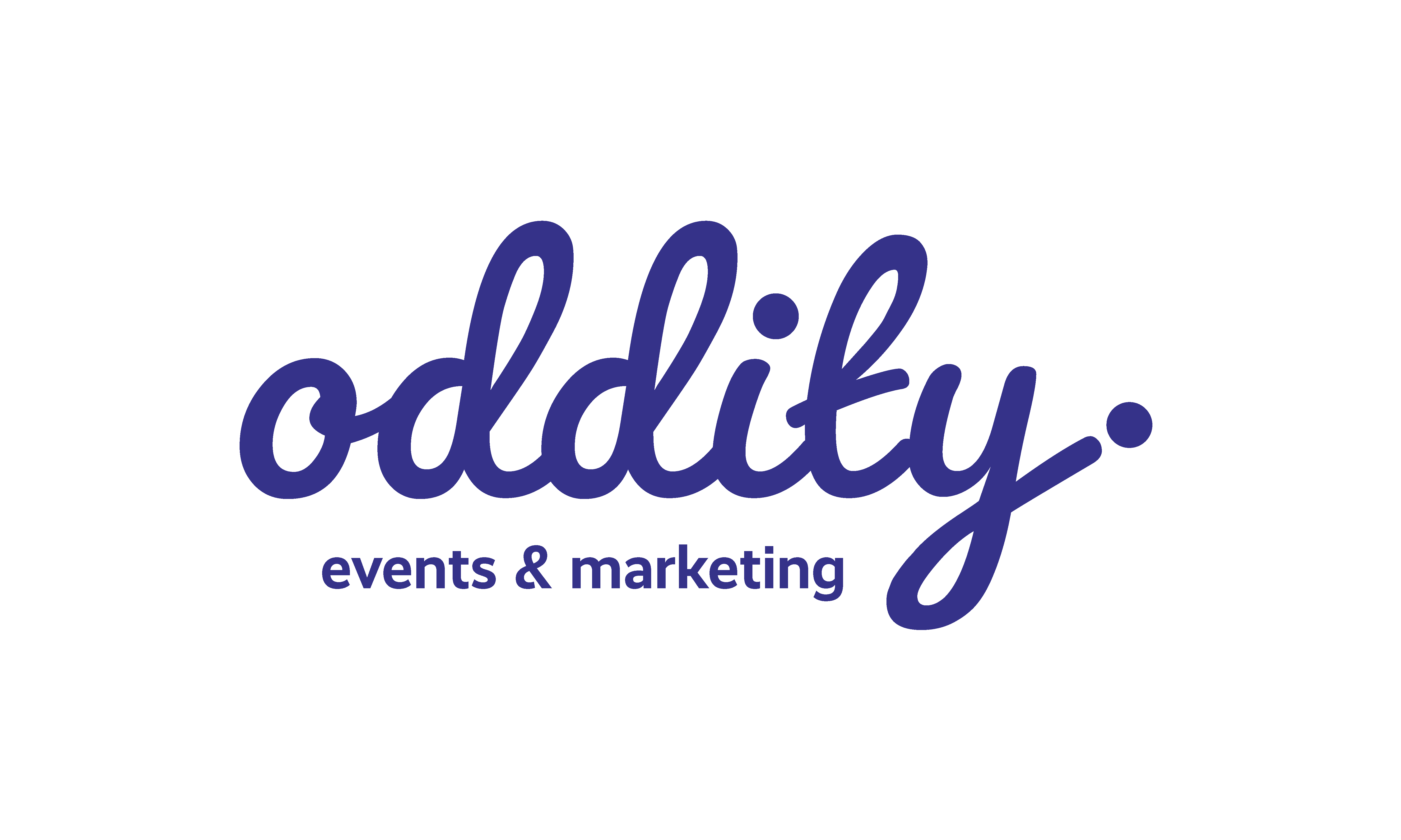
To mark the rebrand, the events agency unveiled a new logo.
Lizzy Eaton, founder, Oddity Events and Marketing, explained: “As a nod of gratitude during our journey as a start-up, we kept the signature Oddity purple and orange, but we updated our logo into something that represents our quirky personality, and we have added to the palette with fresh accent colours of peach, lilac and pale blue-green.”

According to Eaton, the new logo aims to demonstrate how Oddity has matured and evolved as an agency.
She said: “In the past year – particularly since hiring my newest team members – we have quickly evolved into an agency that can ‘do more’ for our clients. Our portfolio is becoming more varied and impressive as we win exciting projects with dream clients who truly align with our values, as well as retaining our anchor clients who have trusted me, and now my team, since I started Oddity in 2018.
“We are really excited to get stuck in with using our new brand and demonstrate depth and creativity with our updated look.”
The Oddity team celebrated its fifth birthday on 31 May at Little Scarlet Door.


