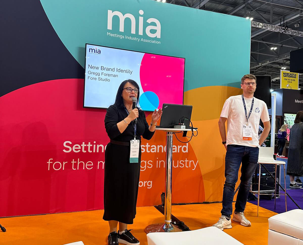
The Meetings Industry Association (MIA) has unveiled a new branding.
The colourful new look has been brought to life by Fore Studio, who were briefed to modernise and refine the association’s brand.
Taking inspiration from the dot above the MIA ‘i’, its circular form celebrates collaboration, networking, and fostering positive relationships while reflecting the core values and objectives of the association in supporting and bringing people together.
Speaking in London, where she outlined the journey to the new brand, MIA chief executive Kerrin MacPhie, said: “Changing the identity of the MIA was something that I wanted to do not long after I joined in late 2021. But changing the look and feel of something that’s been around for such a long time and has so much brand equity and credibility, isn’t something you do quickly.”
The team worked on defining its mission, vision and values. MacPhie added that the MIA’s accreditation, previously AIM accreditation, will now feature the new identity that has helped take the sector through and beyond the pandemic – resulting in nearly 700 members being part of the association’s community.
Describing the new identity as “a massive step, MacPhie said: “Today we’re about inspiration. We’re about colour. We’re about bringing people together. We’re about so much. We now genuinely reflect what we represent, instead of having to tell people who we are. I believe that is a significant difference.”
She added: “We have been delighted with the feedback on our new identity with many describing it as really fresh, contemporary and inclusive.”
To find out more about the MIA and to see its new identity visit: https://www.mia-uk.org/